Content Strategy
How to Use Search Optimization and Content Creation Best Practices to Drive Serious Revenue
By Bernie Smigel on November 24, 2020
On an August earnings call, apparel manufacturing giant Gap reported selling $130 million worth of masks in the second quarter of 2020. Despite being in one of the industries hit hardest by the coronavirus pandemic, Gap did a little search optimization to find triumph in tragedy. And they pulled it off just weeks after the pandemic began, no less!
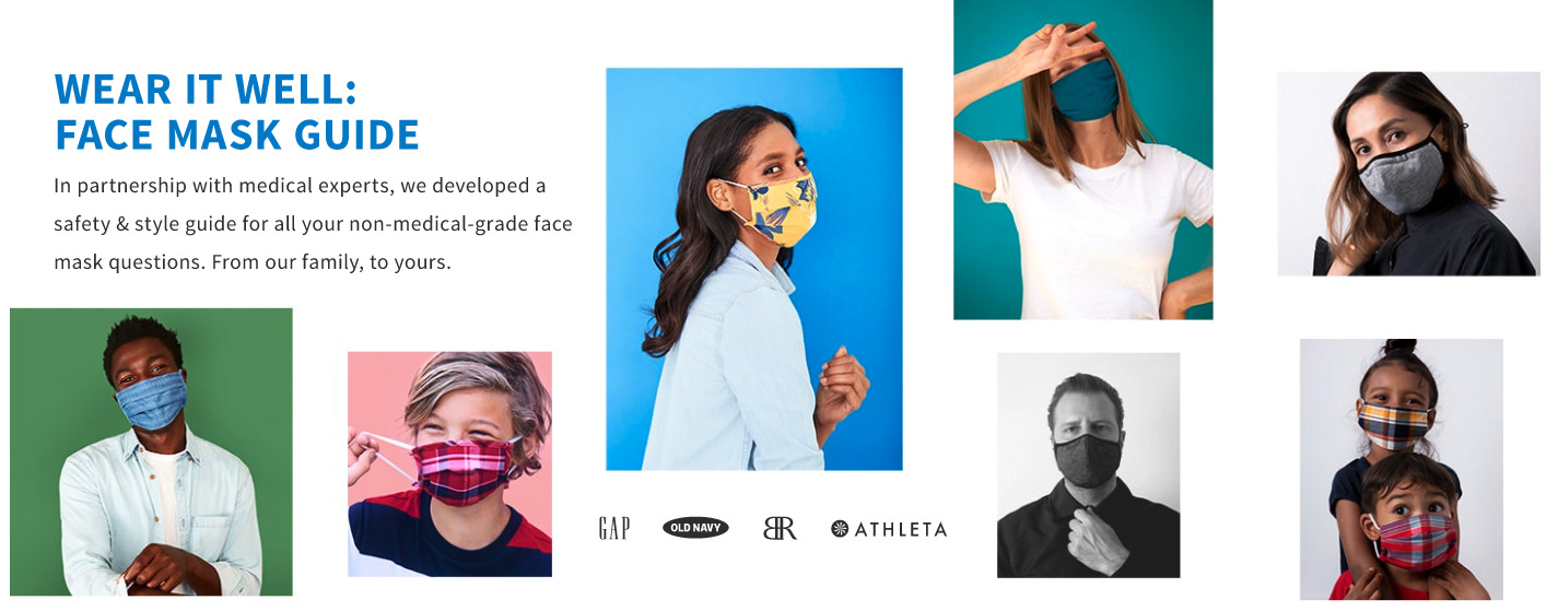
But how'd they do it? Sure, Gap would love nothing more than for consumers to think of them right away when they want to buy masks. But in reality, they have immense competition. To stand out, they made a mask-focused landing page, search-optimized for the keyword "face mask style guide." It ranks #1 on Google search results for the term.
Gap's landing page is a perfect example of a business that's meeting consumers where they are. They worked with a heavily used search term and followed up with clear, engaging content. Follow along on their page and take in these revenue-driving tips for landing pages—your brand may just be able to pull off a "Gap triumph" of its own.

Image attribution: Gap.
Tell, Don't Sell
Gap's landing page doesn't come across as promotional. It's not shouting the mask-discount deals of the century. In fact, within the extensive FAQ content, Gap doesn't always reference their specific face masks for sale. Instead, it tends to speak about face masks in general.
That's because Gap's primary goal with this landing page isn't to promote but to educate. While they include some featured products at the bottom of the page, ultimately, they create mostly educational content in order to cement the brand's status as a go-to destination for mask style and safety. This has helped build rapport for Gap while also keeping them top-of-mind for consumers when they go to purchase masks.
Mix Up Your Media
Bringing in different content elements creates a more dynamic experience. Gap kicks off their landing page with a set of high-quality images to capture attention, along with some copy—a mere two sentences! These first few sentences have some search optimization, but they also get right to the point of what the visitor can expect on the page.
Because answering questions about masks can benefit from a visual demonstration, such as showing how to wear one properly, Gap found that video hit the sweet spot as the primary medium on the page. Featuring an actual doctor to answer these questions with authenticity also helps lend the brand an approachable, human quality.
Showcase and Organize Content Naturally
Gap's full-fledged guide left them with a lot of material. They wisely chose to organize it FAQ style. Take information architecture into account when you build a landing page. How can you group information in a logical, intuitive manner? You may want to take a page from Gap's playbook and create an FAQ, especially if you do keyword research and find that your potential customers are also on the hunt for a high-level, in-depth guide on a given topic.
Pro tip: If you don't have enough content to organize an FAQ-like page, create a few sections with related content grouped together. Don't forget to introduce material with clear, concise headings.
Use Clear, Action-Oriented CTAs
The call to action (CTA) on Gap's landing page follows the "less is more" rule to a T. With a "Read more" function that invites the reader to learn about a subject in detail, "Shop masks" to jump to the bottom of the page and browse featured products, and social media share icons under each of the expert-provided answers, Gap refrains from pressuring consumers and presents them with natural avenues to explore where their interest lies.
Gap didn't stop at their face mask guide material and featured products. At the bottom of the page, they added an empathetic banner that invites readers to learn how the company supports impacted communities. The page ends with a soft sell to join their email list for a discount on their next order.
Be wary of overstuffing your landing page. The fewer elements and widgets you have on it, the less divided your audiences' attention will be. Gap's story about community support makes sense for the page because it's related to the coronavirus pandemic, and it may build brand rapport in some consumers. Still, they chose a banner and a few sentences on the sub-topic, with a CTA to learn more in case the reader is interested.

Image attribution: Gap.
Pro tip: Generally, the farther down on your page something lives, the less likely it's going to be seen. Structure your content with care!
At the end of last year, when thought leaders across industries were publishing lists of trends to watch out for in 2020, nobody's list was topped with masks. But no matter what's going on in the world, knowing your consumers and offering them meaningful, engaging content never goes out of style for content marketers.
For more stories like this, subscribe to the Content Standard newsletter.
Featured image by Mehrnegar Dolatmand on Unsplash.

